In my previous article I explored some of the ways that you can use two contrasting colours, orange and blue, that appear in nature to create atmospheric images full of emotion.
Today I’m going to look at ways you can use other bright colours effectively.
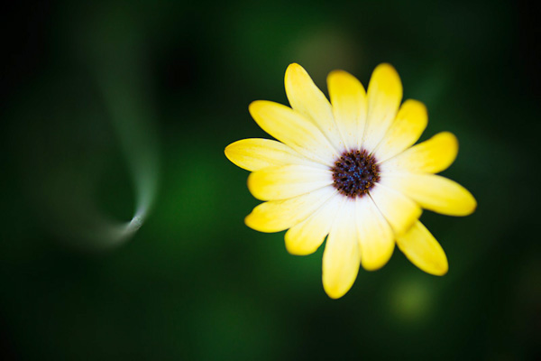
Let’s start with a simple example. Flowers are a common, brightly coloured subject. If it is summer where you live right now you there may be public gardens close to you where you can practise taking photos like the one below. One of my favourite techniques is to photograph red flowers against a green background:
Bold colour is part of the composition of this photo. To see why, let’s take a look at the colour wheel again:
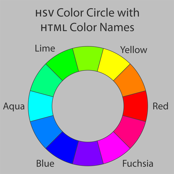
The colour wheel tells us that certain colours have a dynamic relationship. Colours that are on opposite sides of the wheel, such as red and green, are said to be contrasting colours. That’s just a way of saying that the human eye can easily distinguish between these colours. So, in the above photo, it’s easy to tell the red flower from the green background, and that makes the photo more interesting to look at.
Man-made colours
Now, the most likely place to find bold colours is with man-made objects. Humans have a tendency to make brightly coloured objects, and we can take advantage of that. Here are a few examples to show you what I mean:
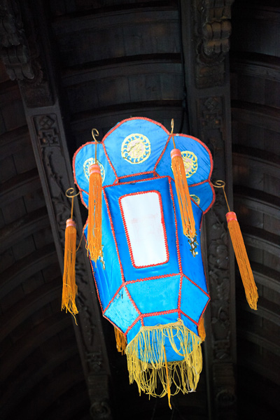
The blue colour in this Chinese lantern is very intense. It helps that the tassels and trim are yellow, a colour that contrasts with blue (see the colour wheel). It also helps that the background is a neutral shade. It doesn’t compete with or distract attention from the lantern.
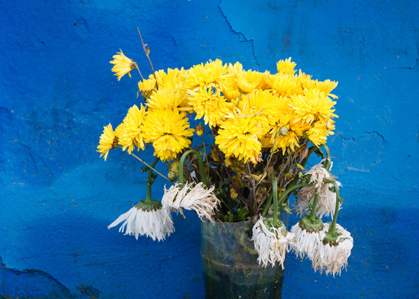
Here’s another example of the blue/yellow dynamic in action. The flowers are natural, of course, but the background is man-made. Intense colours like this shade of blue occur rarely in nature.
Blue and red is another powerful colour dynamic.
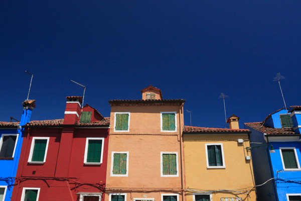
This is a photo I took in Burano, an island near Venice known for its colourful buildings. I made the most of the colours by using a polarising filter on my lens.
Polarising filters work by eliminating glare from reflective non-metallic surfaces. This results in deep blue skies and more saturated colours. It’s an effect that can’t be replicated in post-processing, making a polarising filter an essential piece of gear for taking photos like this.
Using colour boldly
The way I see it, there are are two ways to utilise strong colours. The first is the one that we’ve seen so far – using bold colours to create strong images where the use of colour is an important part of the composition.
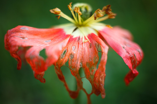
The second is use colour boldly. The idea is to create near abstract images that are very much about the colours and little else. They probably wouldn’t work in black and white, or if the colours were subtle rather than strong. Here are some examples:
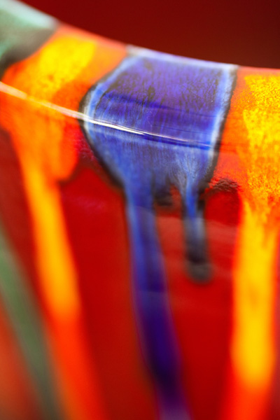
This is a close-up I took of a vase in a pottery store. I closed in and created a composition that is really about the streaks of colour and little else.
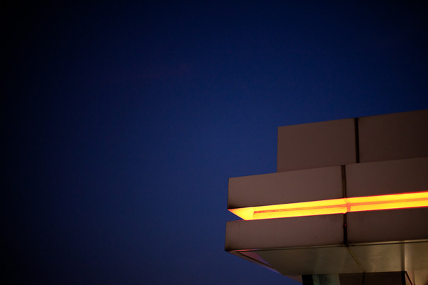
A photo taken in Hong Kong. There are no clues to the location in the photo – it is simply a photo of an orange light against the night sky. Very abstract, and almost entirely about colour.

I took this photo close to my home. It was dark and the glow from the neon light caught my eye.
Simplicity
On a final note I’d like to mention that throughout this article the photos have benefitted from keeping the composition simple. There is little to distract from the main subject and the use of colour.
No comments:
Post a Comment